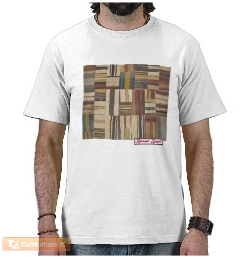
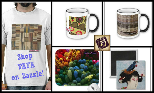
On my last post, I announced that I was setting up a shop on Zazzle for TAFA. Since then, I have worked steadily away at adding new products. I put the word out to our members on our Facebook group and several were excited and kindly donated their images for the shop. TAFA gets 20% of the sales and the members don’t get anything except for a referral on the listing. I also try to add their logo to the products wherever possible. This is more of a slow fundraiser… So far a mug and a card have sold with a whopping profit of $3.18! Woo hoo!
Now that I have been at it awhile, I thought I would share some of the process and my thoughts on how it all works, in case any others out there would like the tips.
Product Design
In theory, Zazzle has made it seemingly simple to design the hundreds of products they have available. They have a template page with blank products, you load an image, it gets plastered to the product and then you can either delete the ones you don’t want or tweak them if they need it (most do). Here is how that page looks:
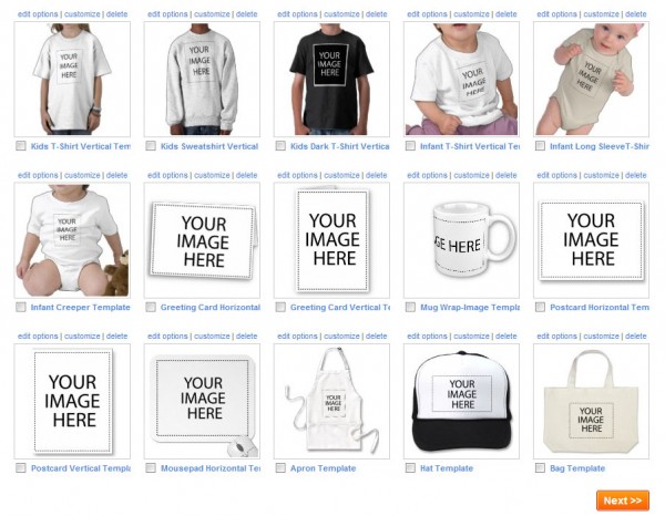
It’s a long page with about half of it dedicated to cell phone covers and laptop skins. Most of the items also have a variety of optional designs that might involve color, size, and materials. For example, the canvas bag (last image) has about 6 options. The t-shirts have models of various ethnicities posing in different ways so that you can imagine how the image might look on many body types. Overall, this allows for nice variations of the products so that you don’t have to see the same thing over and over again in the shop. But, it is time-consuming. It takes me about 2 hours to go through this page and tweak the products.
Then, there are a whole bunch of other products that don’t show up on this page that need to be loaded individually. In the template process above, you can add one title, your description and key words and click on some other category stuff they want and you are done. On these other products, you need to do that over and over for each one. Here are some of the products that are not there:
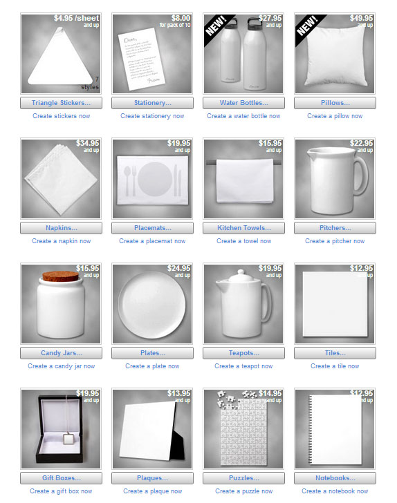
It’s a bummer because some of my favorite ones are in this group and would work really well with our textile theme. All of the kitchen stuff would be great with our images! And, the tile is one of my favorites as you can actually use it as a supply to make something else. I’m still stuck in the dark ages and wash my dishes by hand. My sink is under a large window and under it there is some space that would fit a row of these tiles, a perfect place for a TAFA backsplash! I am going to make a bunch of these individual tiles as I want some for myself!
So, the process is not fast. There is a way to create templates of your own, but I haven’t figured that out yet. 🙁 And, the editing tools are not as user-friendly as they could be. It took me awhile to figure out that I could add colors to the backgrounds on images and that there is an undo button. Some of the editing tools are far away from the image you are working on, forcing you to scroll up and down on a page as you make changes.
I have loaded products on many sites including eBay, Etsy and Trocadero and would rate the Zazzle process at a 7. It’s not horrible and does give you a lot of options, but the toolbox could be designed much more clearly and there could be shortcuts to the loading process that are easier to figure out. If I were setting it up, I would add all of the things that go with that design, then have ALL of the products available on one page. And, if there are ones that you don’t plan on using, delete it to some folder where you don’t have to look at it again unless you change your mind.
Shop Layout
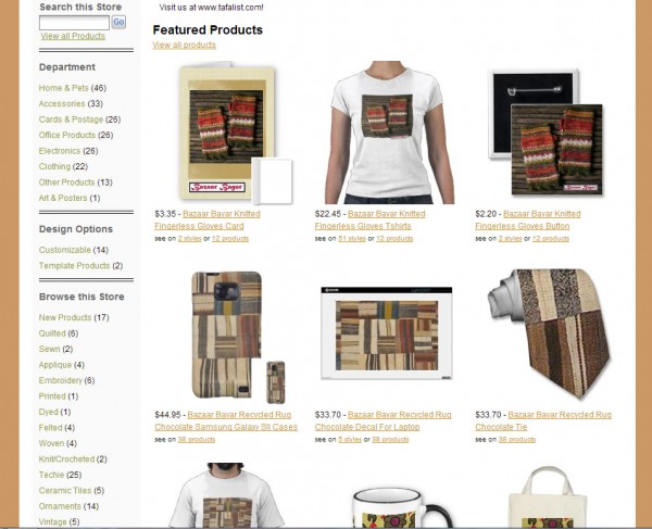
Zazzle has done a pretty decent job in allowing each seller to tweak their shops and personalize how they look. You can have a banner or not, use their navigation, set up your own categories and have your home page feature products in many ways. Figuring it out, however, is definitely NOT intuitive and very confusing. I had to go back and forth many times in editing the shop and still don’t understand what some things mean. I am pretty pleased with how it looks now, clean and inviting. My biggest complaint is with the navigation. Look closely at the left sidebar:
The top list, Department, is Zazzle’s default list of categories. Under Browse this Store you see another list, one that I set up based on textile techniques. The numbers in parenthesis let you know how many products are in that department or category. Zazzle’s and mine don’t match up in quantity. That is because in their list they are counting items and in the one I created, they are counting designs. So, we see (6) under Quilted which means that there are a whole bunch of products that have the quilted design. I added Techie, Ceramic Tiles, Vintage and Supplies as separate categories to make them easy to find, but then where do you put a vintage embroidery? What makes it all really confusing is that if you click on a category, the original navigation list disappears and you have to either click back to the page you were on OR click on TAFAshop at the top of the page to see the full list again. If you click on See All Products, you get all of the versions of the one design and you have to go through many pages to get an idea of what designs are there. This is a big problem as people easily get lost and don’t find what they are looking for.
Solution for navigation? Use the search box and type in the product or TAFA member you are looking for. Much easier to see the shop that way. An online shop with a bad navigation system is about the same as a brick and mortar shop that is dirty and has poor lighting. If you can’t see a clean product, people won’t buy it.
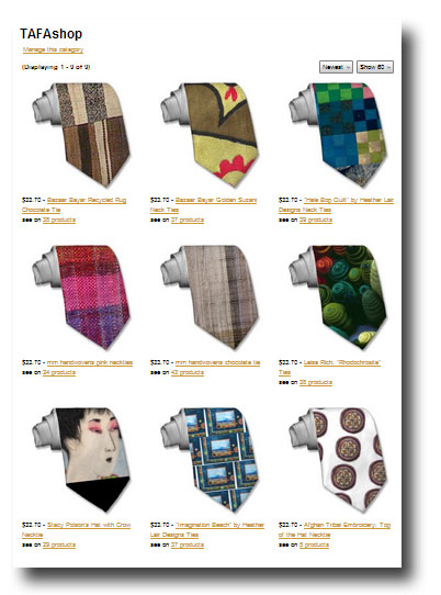
There are also some weird Zazzle classifications, like ties and baby pacifiers are both considered “clothing” when they should be under “accessories”.
Zazzle Search
I’ve looked for the products that I have listed using Zazzle’s search and they are pretty much buried or hard to find. It looks like products rise to the top based on user comments and likes. And, we probably have not been up long enough to show up on the internet search engines, so it probably takes time to get found. I have set up a place where I can list other TAFA members with Zazzle shops and if like-minded shops there want to exchange links like this, that could help all of us, too: http://www.zazzle.com/tafashop/about. As with Etsy and other selling platforms, marketing has to come from the outside. My expectation is that the most interest will come from the TAFA members, their family, friends and followers. “I may not be able to afford Heather’s quilt, but I sure can think of her when I use her quilt mug!”
Become an Affiliate!
The other way we can generate income is if members and others become a Zazzle Affiliate. They have a page with links and tips that explains more about it: Affiliate Info. The basic idea is that you sign up over there and they assign an id for you that gets embedded into their links and widgets. These can point to any item or shop on Zazzle and get pasted into blog posts, sidebars, and social media sites. Affiliates get 15% of the sales! If you like what we are doing, do join in and help spread the word around and make some money on the side….
Money?
Speaking of money, how does that work? Like I said before, I don’t think this is a big money-maker, but you never know… I just searched for Zazzle on Pinterest and there are loads of Zazzle products there. I’m sure that these are affiliates, hard at work. I wonder if they know that Pinterest has a history of replacing affiliate links so that they get the percentage? Harumph.
So, here is the bummer about payments on Zazzle. You have to wait until your cut reaches $50. They will then issue payment ONE MONTH later for that amount. I am used to selling something and getting paid for it right away. In thinking about this, my guess is that Zazzle has to have some time to deal with returns, process shipping, making sure that sales go through and all of that. Advantages: I don’t have to worry about shipping, returns or customer complaints (not that I ever have any)… So, this needs to be seen as a long-term effort.
This about ends my Zazzle Review. Conclusion? It’s time-consuming with low returns but could bring in some extra cash down the road. The main reason for doing it for TAFA is that it exposes our members to a whole new population outside of our niche, gives us some access to member products, and gives me a TAFA product which I can use for thank-yous, promotions, etc. (Plus, I want those tiles!)
And, part of me really enjoys the design process. So much that I am using some of my old photos and other products to set up my own Zazzle shop! Check out Rayela Art! I don’t have much there yet and it’s not a priority, but here are a couple of the images that will be used there:
 A photo I shot in Brazil in 1980
.
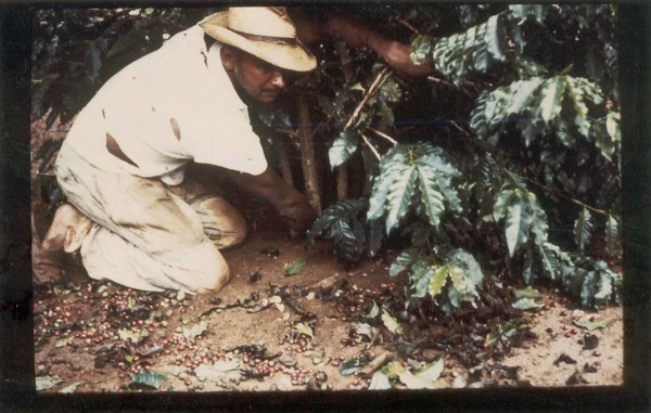
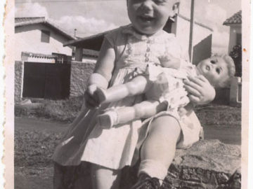
Photo by my father, Brazil, 1967
.
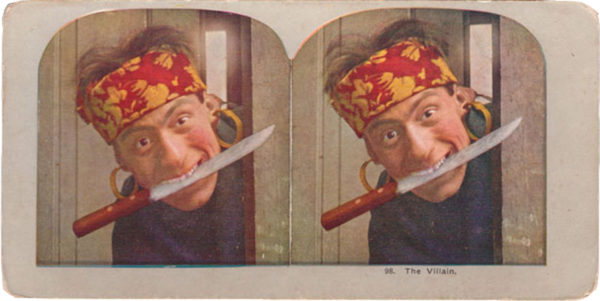
Stereoviews!
.
Questions/Comments
Have you shopped or sold on Zazzle? If so, what was your experience? Are you thinking of opening a shop there? What would be your theme? What do you think about all of this? I’m interested in feedback, so do share them in the comments box.
very instructive Rachel – thank you!
Thanks Rachel,
It doesn’t seem as daunting as I thought it may be, thank you. I would like to open a shop there but I need to sort my others out properly first.
Great, Dana! We can link to each other!
Rachel, you have done a fabulous job! I have also heard from several people though, that they have had NO sales on Zazzle and are leaving it in favor of other selling venues. As for myself, I AM going to order a case for my phone with my design on it, but have been waiting for my husband to dig himself out of a campaign he has been working at 20 hours a day all week, so he can help me choose which is the better case from the two offerred. So- you will have another sale! Having said that, the cases are three times the price of other fab cases out there, as you and I discussed! I think this IS a great idea anyway for other products, for exposure, and who knows what the future will bring!
Thanks, Leisa! Yes, they do seem pricey to me, too. I suppose it has to do with our cuts, associate percentages, etc. I visited their forum and read quite a few reviews before deciding to do this and people did rave about the quality of the printing and materials used, so that was good. Some of the veteran sellers in the forum talked about their experience and I think, like anything else, it has to do with having a large enough base, good designs and having enough of a selection to appeal to different tastes. We’ll see…
Great review, Rachel. Thanks for putting so much time and energy into setting up the Zazzle shop!